

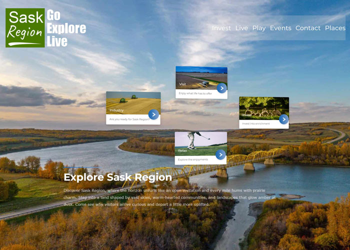
Partnering with Sask Region, we built a sleek, mobile-friendly website from the ground up. The approach centered on clarity and ease of use, pairing straightforward navigation with a strong visual presence that reflects the organization’s character, priorities, and sense of place.
To represent their brand, we chose the following branding styles:
Typeface: Inter
Colors:
Logo: 
Key features of the project include:
- Streamlined, clutter-free design that makes navigation effortless
- Straightforward booking and contact forms for quick interactions
- Mobile-first build that adapts smoothly to any screen size
- Tailored visual identity with custom icons and brand accents
- Built-in contact tools and clear calls to action that encourage engagement
- Search-engine-ready structure with performance-focused load speeds